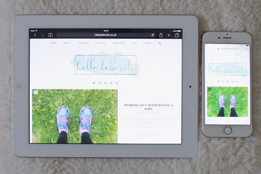
I love a good blog redesign. I’m lucky to have a programmer for a husband so he’s created this brand new blog design for me. I spent ages mocking up designs of what I wanted it to look like. He then turned those sketches into fully working template for WordPress. I love it!

I liked my old design in that it was simple and clean but when I started my YouTube channel I felt like I needed a change. I wanted a new logo that would go across all my social channels and to have a more cohesive look. I’ve also renamed all my social channels to match my blog – you can find them at the top or down at the bottom.
New Logo

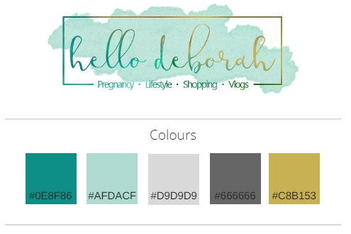
The new logo took me ages to design. I wanted to keep the watercolour feel and my favourite colour but I wanted it to look more elegant. I kept fussing with the colours and he made quite a few logos before I finally picked the one I loved most. Having finalised the logo it really helped develop a colour scheme for the blog, which is reflected in the style guide.
Style Guide
I can be super organised, so to help Simon in the development I created a style guide. This included the colours, hex codes, the fonts and what H1-3, etc would look like. It also included a smaller logo design and how I wanted the social media icons to look. This is great as a reference for him when coding the site and for me to have some consistency in the design.

If you want to create your own style guide there’s a lot of inspiration on Pinterest.
My favourite bit
I love how the blog posts now look. It brings more attention to the imagery but also makes the content stand out too. But my real favourite bit is the logo – I’m easily pleased. Actually, if you ask my husband he’ll say the exact opposite. I’ve changed so many bits along the way and he’s worked ridiculously hard to make me the design I want. I am incredibly grateful and I’m sure we both hope I won’t get inspired for a new design any time soon!

